Publishing Identity & Book Covers
LILITH
Three novels, one illuminated language.
A publishing identity built on illuminated type
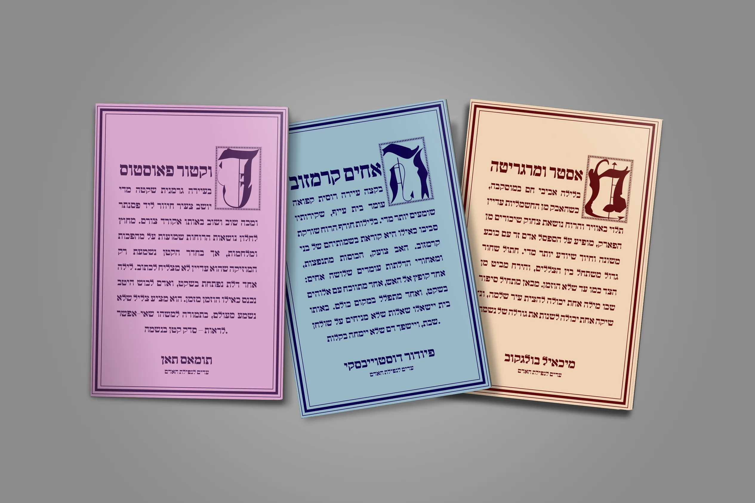
Lilith is a Hebrew publishing identity and a cover series for a themed set of classic novels on faith, guilt and transformation: Thomas Mann's Doctor Faustus, Dostoevsky's The Brothers Karamazov and Bulgakov's The Master and Margarita. Each cover pairs a hand-built illuminated initial with a soft, single-color field.
- Year
- 2026
- Type
- Logotype, Book Covers, Editorial
- Role
- Typography, Cover Design
- Tools
- Illustrator, InDesign
Development
The identity developed through a sequence of typographic and editorial experiments. Historical manuscripts, illuminated initials and contemporary Hebrew lettering informed the early research, while several distinct cover directions helped clarify how the three novels could function as one publishing series.
The final system emerged through reduction: expressive historical references were retained, but translated into a cleaner and more consistent contemporary language.
Research & References
The project began with research into illuminated manuscripts, early printed books, Hebrew lettering and publishing identities that combine literary history with contemporary typography.
Rather than reproducing a specific historical style, the research focused on recurring principles: ornamental initials, framed compositions, dense textual fields and the relationship between lettering and image.

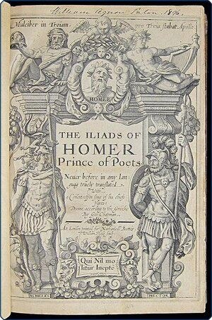
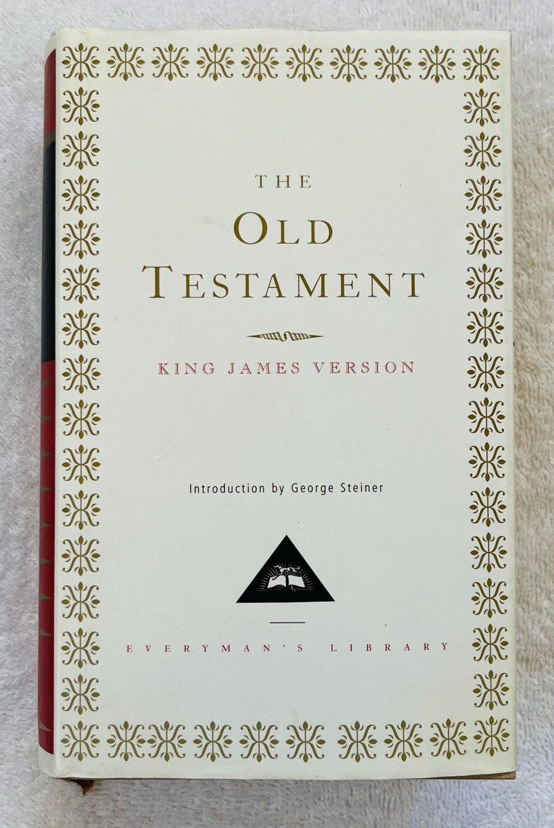
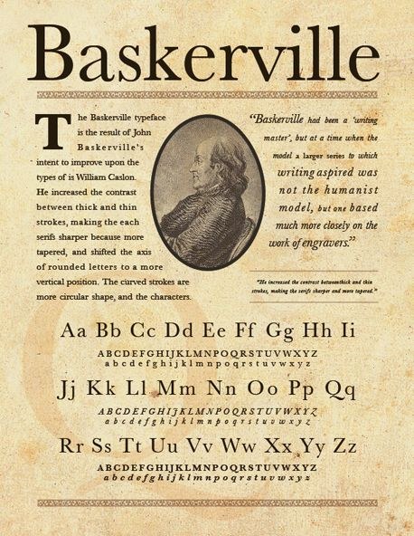
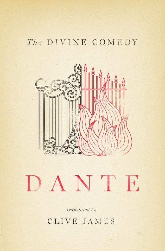
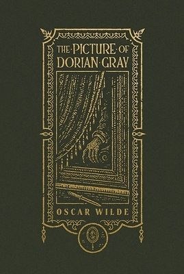
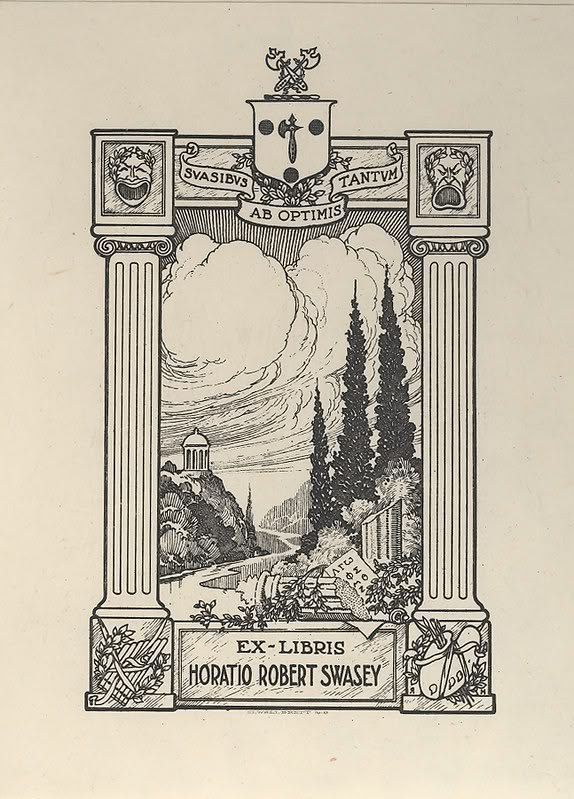

Research and reference moodboard.
Wordmark Exploration
The Lilith wordmark was developed through multiple approaches to Hebrew display lettering. Early studies ranged from fluid calligraphic constructions to geometric and historically influenced forms.
The selected direction retained the irregular rhythm and expressive terminals of the earlier sketches while becoming more compact, recognisable and compatible with the illuminated initials used across the series.


Direction 01Calligraphic Rhythm

Direction 02Geometric Construction

Direction 03Historical Letterforms

The final wordmark balances historical character with a clearer contemporary silhouette, creating a direct formal connection between the publishing identity and the cover initials.

Cover Directions
Several cover systems were tested before the final direction was selected. Each explored a different relationship between literary content, typography and historical reference.
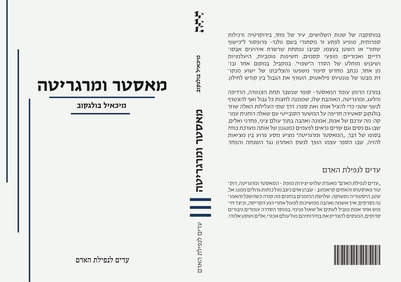
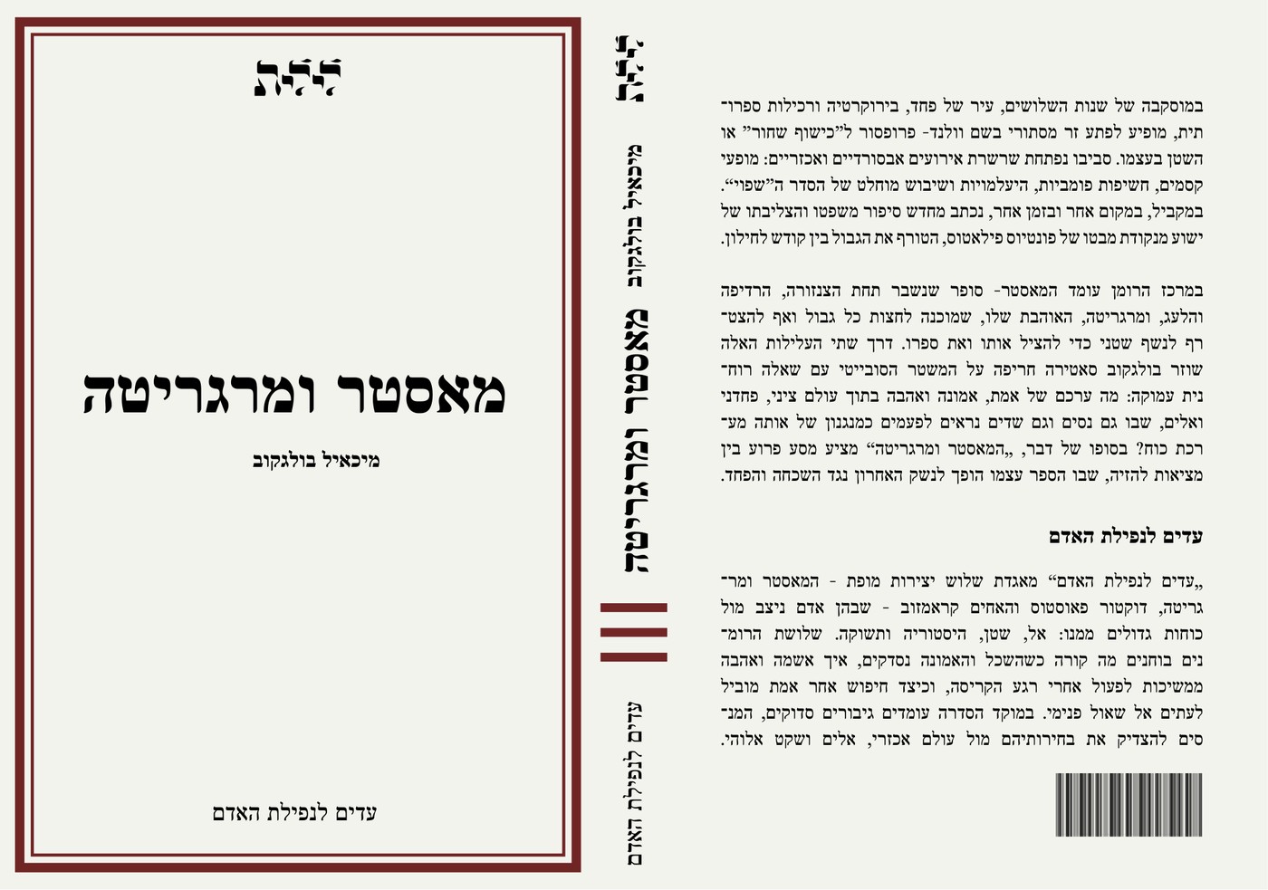
Direction 01
Linear System
The first direction used light backgrounds, fine rules and a rational editorial structure. It established consistency across the series, but the visual language remained too neutral and did not yet express the psychological intensity of the selected novels.
Direction 02
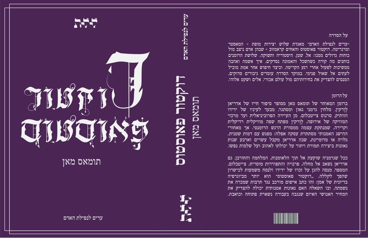
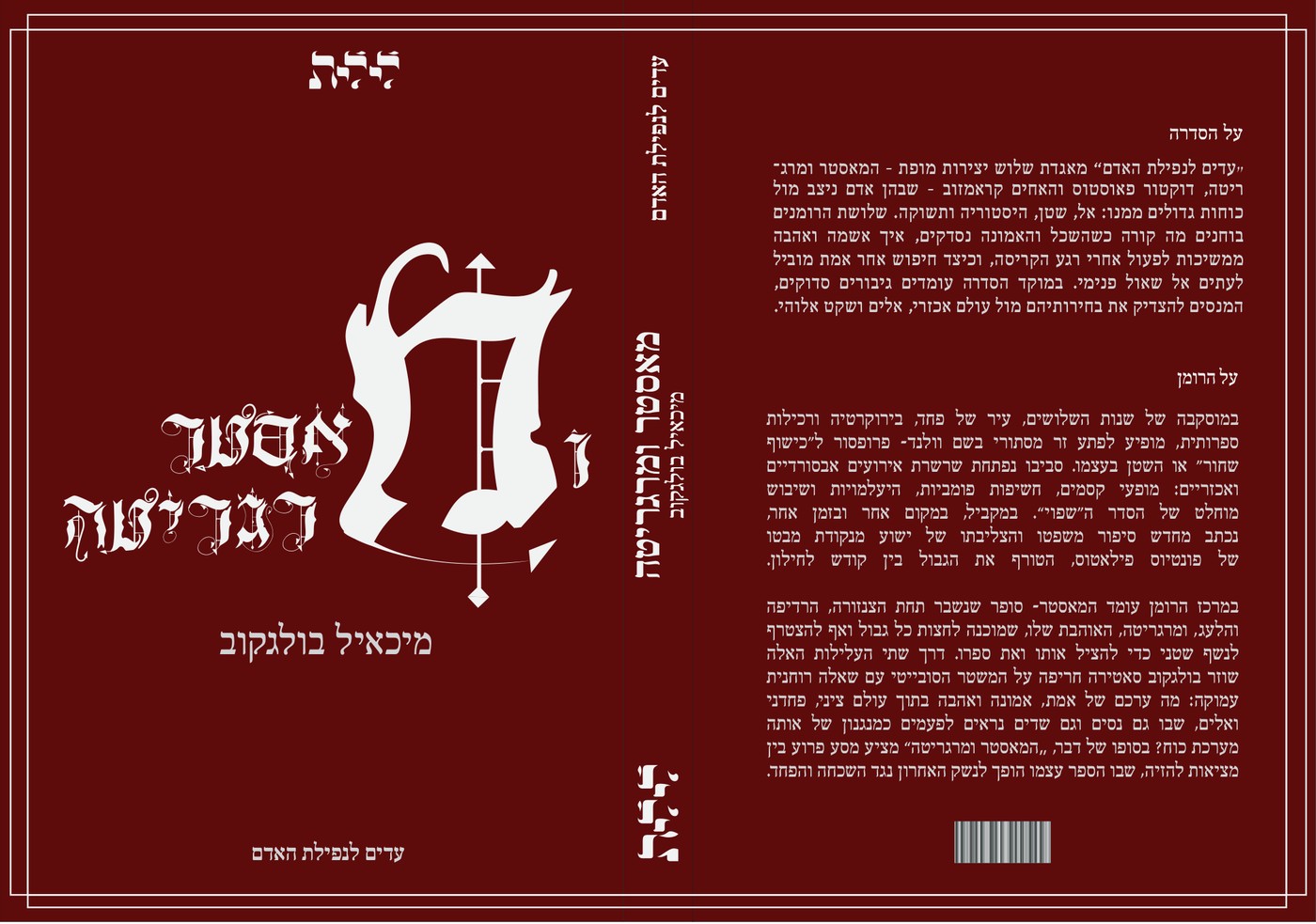
Dark Gothic Direction
The second direction moved toward dark fields, dramatic contrast and explicitly Gothic typography. Although visually forceful, it became too theatrical and literal, allowing historical style to dominate the identity of the publishing series.
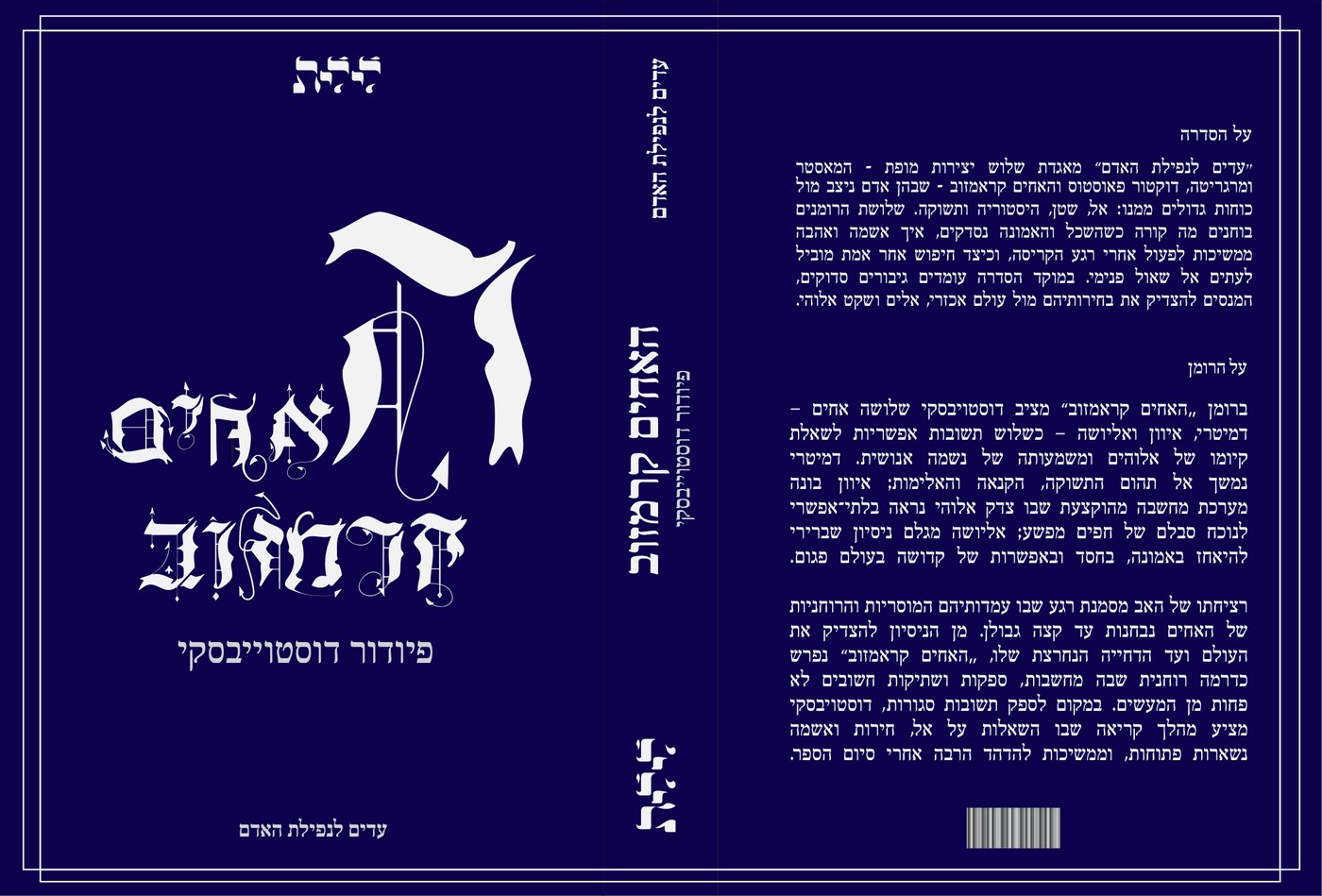
Final Direction
Illuminated Initials
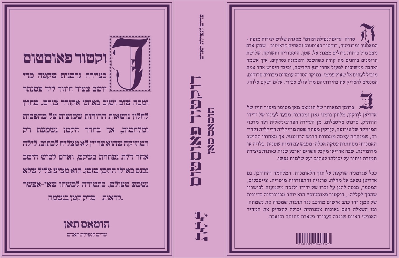
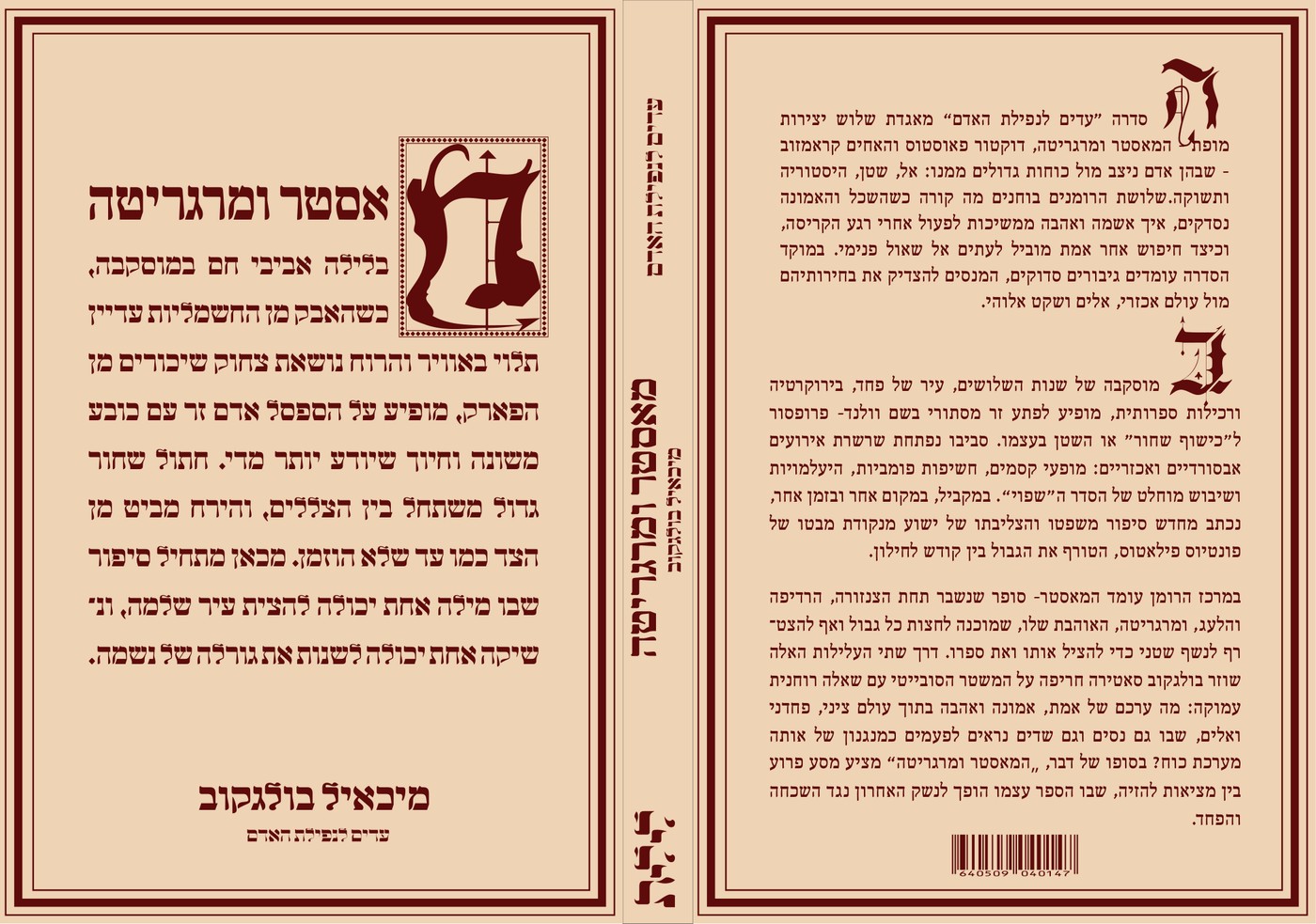
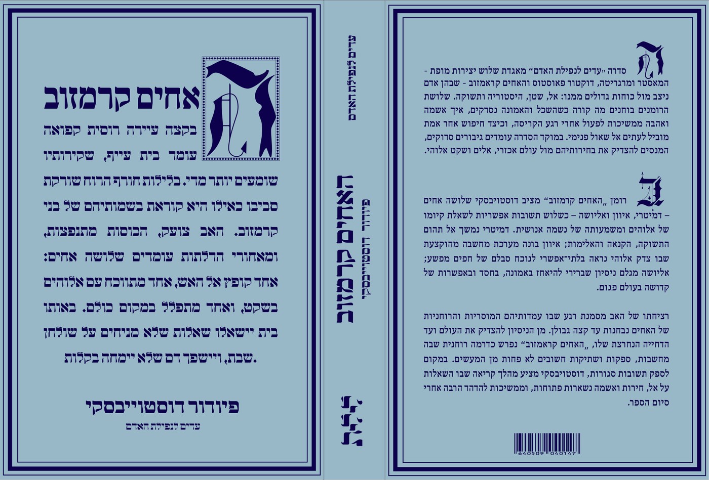
The final direction replaced illustrative Gothic language with a clearer system centered on custom illuminated initials. Each novel received its own initial and color field, while the shared border, grid and typographic hierarchy unified the books as one collection.
System Refinement
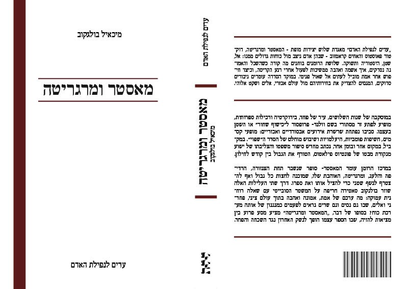
Once the final direction was selected, the system was refined across the front cover, spine and back cover. The border, title field, illuminated initial, supporting text and publishing details were aligned through one shared grid.
This structure allowed each book to maintain its own character while remaining visibly part of the same publishing identity.
Lilith, drawn by hand
The imprint's name, לילית (Lilith), is redrawn as a custom Hebrew display lettering system, sharing its flowing terminal strokes with the illuminated initials used across the cover series.

Cover series
Each title gets its own field color and illuminated initial while sharing the same border, grid and back-cover blurb layout, so the three novels read as a single boxed set.


Closing statement
Lilith's hand-drawn illuminated type carries the series identity across three covers, giving each novel its own cover while reading unmistakably as one set.
The development process moved from an ornate, Gothic-leaning first pass to a clearer contemporary system, keeping the hand-drawn character but tightening its execution.