iOS Wallet Feature
WALLET
Spending insight, before it becomes overspending.
A wallet feature built for everyday financial awareness
Wallet is a conceptual feature extension for iOS Wallet-class apps, transforming everyday spending data into practical financial guidance. The experience combines category-based tracking, personalised insights, spending limits and relevant discounts within one familiar mobile wallet environment.
- Year
- 2026
- Type
- UX/UI Design, Mobile App Feature
- Role
- Product Design, UI Design
- Tools
- Figma
Where the idea started
Problem
Young adults beginning to manage money independently can see their balance and transaction history, but often recognise overspending only after it has already happened. Financial statistics, budgeting tools and discounts are usually distributed across different applications and websites.
User Need
The target user needs one accessible place to understand spending patterns, recognise risky behaviour and find useful offers without navigating between multiple services. The experience must feel supportive and easy to use rather than critical or overwhelming.
Solution
The proposed Wallet feature connects spending data with immediate action. It tracks expenses by category and time period, identifies overspending, suggests practical saving steps, allows users to set category limits and gathers relevant discounts in one familiar interface.
Design Evolution
The interface developed through three distinct stages. Early explorations established the core features, the second version introduced a more unified product structure, and the final system refined hierarchy, navigation and category-based visual communication.
01
Initial Exploration
The first version established the main product ideas: spending categories, statistics, limits and saving advice. A dark base carried colourful, varied accents across categories and cards, which made the experience feel approachable early on, but the individual features still read as visually disconnected and the navigation system was not yet fully resolved.


02
Unified Interface
The second version pulled the interface into one monochromatic green system with a clearer navigation structure — a persistent bottom bar and consistent card styling — and stronger connections between statistics, discounts and spending limits. The single-colour system improved cohesion, but did not yet provide enough distinction between spending categories and interaction states.


03
Final System
The final version retained the consistent dark base while assigning each spending category its own semantic colour and icon. This made category recognition, financial patterns and warning states easier to distinguish without fragmenting the overall product identity.


Final system
Four connected destinations carry the whole feature: a home screen with balance and budget, statistics with an editable limit, category insights with saving tips, and a discounts hub.


Category Colour System
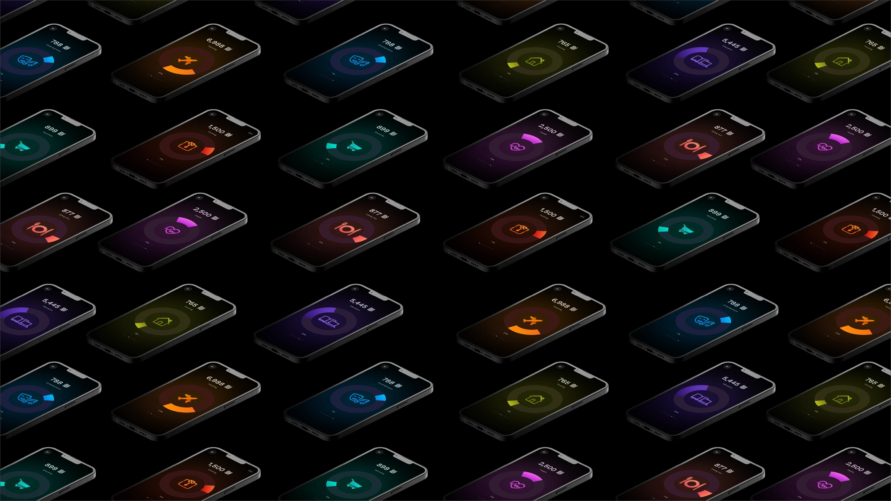
Each spending category is assigned a distinct colour and icon. The consistent dark interface provides a shared foundation, while category-specific accents help users recognise financial patterns across cards, charts, progress indicators and detailed screens.
- EducationBook & laptop icon
- HealthHeart & pulse icon
- EntertainmentMasks & music note icon
- GroceriesShopping cart icon
- ClothingShirt & tie icon
- HousingHouse icon
- TravelingAirplane icon
- Eating OutFork, plate & knife icon
User Testing & Iteration
Prototype testing helped identify which parts of the feature felt most useful and which interactions required further clarification.
01
Centralising Discounts
Users responded positively to having relevant discounts collected in one accessible location. One participant also suggested adding direct links to the stores, making the experience more actionable.
02
Saving Advice
The saving-tip concept was received positively, although some users felt that the advice did not always provide information they had not encountered before. This highlighted the need for more contextual and behaviour-specific recommendations.
03
Navigation Clarity
Some users did not immediately understand the meaning of the icons in the bottom navigation bar. This showed that visual consistency alone was not enough and that navigation symbols needed clearer communication and stronger active states.
These findings informed the refinement of navigation, category differentiation and the relationship between financial information and user action.
Interactive Prototype
Explore the prototype to follow the experience from spending overview and category statistics to personalised insights, spending limits and relevant discounts.
Closing statement
Wallet is a concept for iOS Wallet-class apps, turning everyday spending data into practical financial guidance instead of a static list of transactions.
A category colour system, tested and iterated with real users, ties the home screen, statistics, insights and discounts into one coherent flow.