Editorial Brochure
CONSPIRACY
Don't believe us.
A newspaper-grid brochure about conspiracy theories
"Conspiracy Theory" is a 26-page editorial brochure exploring why conspiracy theories spread, from moon-landing skepticism to modern anti-vax movements. A tight black-and-white grid, archival imagery and a tabloid-style typographic voice hold the whole piece together.
- Year
- 2026
- Type
- Editorial Design, Print
- Role
- Art Direction, Layout, Motion
- Tools
- InDesign, Photoshop, After Effects
Design Process
The project was developed as a single visual system rather than a collection of separate outcomes. Research, editorial experiments and interface studies gradually established a language that could move between print, digital and motion while retaining the same sense of uncertainty, evidence and controlled disruption.
Research & References
The process began with research into both the subject of conspiracy theories and the visual mechanisms through which they gain credibility. Archival photographs, newspaper layouts, classified documents, Wikipedia structures, handwritten notes and fragments of alleged evidence became a shared field of reference.
The objective was not to illustrate individual conspiracy theories, but to understand the recurring visual grammar that makes incomplete information appear persuasive, urgent or authoritative.


Editorial Exploration
Early editorial studies tested several approaches to density, hierarchy and image scale. Some versions relied on conventional columns and continuous reading, while later iterations introduced sharper contrasts, enlarged statements, black interruptions and more deliberate areas of silence.
These experiments helped transform the publication from a conventional informational layout into a visual system that reflects the unstable relationship between fact, interpretation and belief.


Grid & Typography
The editorial system evolved through repeated adjustments to the grid, typographic hierarchy and rhythm of the page. Dense multi-column layouts were gradually simplified, images gained greater scale, and black fields became structural devices rather than decoration.
The final balance was built through contrast: evidence and interruption, density and emptiness, authority and doubt.
Early

Development

Final

Website Exploration
The website extended the editorial system into an interactive environment. Early interface studies tested different ways of organising articles, navigation and image fragments before the final structure was established.
The digital version preserved the publication's typographic tension and fragmented evidence while adapting the experience to scrolling, interaction and changing screen sizes.
Initial direction

Second direction

Final interface

Design Principles
- 01Evidence without certainty.
- 02A single visual language across print, web and motion.
- 03Tension through hierarchy, interruption and controlled noise.
The Final System
The final system brings editorial design, interface and motion into one coherent environment. Each medium has its own behaviour, but all three share the same visual logic—fragmented information, controlled contrast and the unstable boundary between knowledge and belief.
Publication

Website

Motion

Inside the brochure
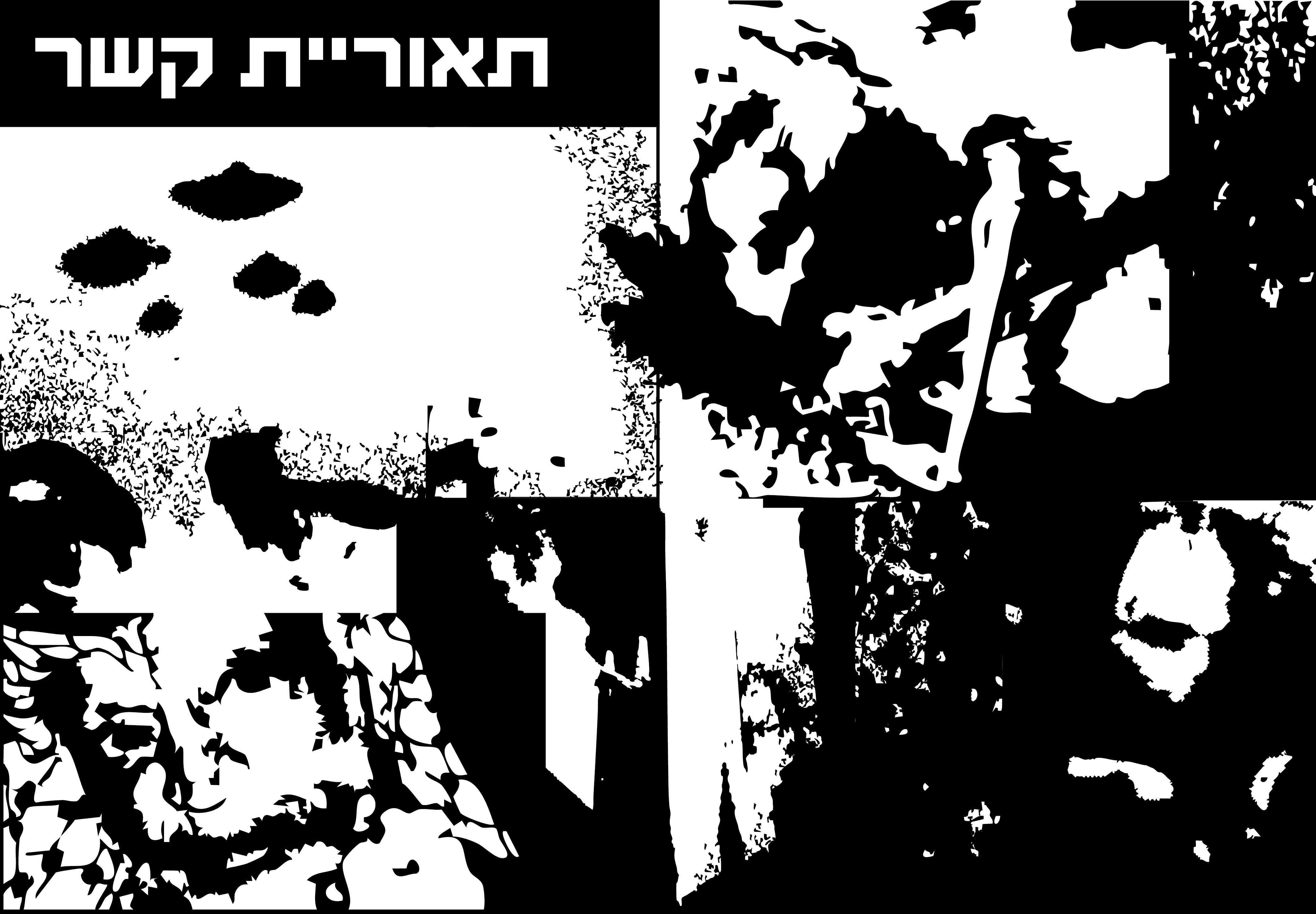
The cover sets the tone with a distressed, high-contrast collage. Inside, a consistent newspaper grid runs across 26 pages, mixing archival photography, statistics and long-form Hebrew text.


Motion teaser
A short, glitch-textured teaser carries the brochure's voice into a vertical video format, built to promote the piece online.
The event landing page
The print piece grew into a full event website for the screening night — a dark, cinematic, right-to-left Hebrew landing page with looping background footage, a live countdown and a film-by-film program. Below is the real site running live; scroll inside the frame to explore it.
Closing statement
The brochure translates research into conspiracy theory into a disciplined print system, then extends that same visual language into motion and a live event site.
A consistent newspaper grid carries archival photography and dense text throughout, giving the brochure, trailer and web presence one shared voice.