Logotype & Event Posters
YMCA
Stained glass, rebuilt as a trilingual print system.
A print system for the Jerusalem YMCA
The Jerusalem International YMCA is one of the city's most recognisable architectural landmarks. Its visual identity combines stone arches, decorative geometry, stained glass and a multilingual cultural context shaped by Hebrew, Arabic and English.
This project translates those architectural qualities into a contemporary visual system for the building's events. The system includes a new logotype, a trilingual typographic language, a pair of event posters and a short motion piece.
Rather than reproducing the building literally, the project extracts its structural principles: symmetry, verticality, modular divisions, ornamental rhythm and the interaction between light and dark.
- Year
- 2025
- Type
- Logotype, Posters, Print, Motion
- Role
- Graphic Design, Typography
- Tools
- Illustrator, Photoshop, After Effects
Architectural Source
The starting point of the project was the architecture of the Jerusalem YMCA itself.
Archival and contemporary photographs were examined not simply as references, but as a collection of recurring visual structures. The building's tall arches, circular stone elements, stained-glass windows and repeated geometric divisions formed the basis of the project's graphic language.
Three qualities became especially important: the vertical rhythm of the architecture, the fragmented geometry of stained glass, and the balance between monumentality and ornament.
These observations were gradually reduced into modular shapes that could operate across identity, typography, print and motion.


Logo Development
The logotype developed through a series of formal studies based on the building's arches, window proportions and ornamental geometry.
Early sketches explored direct references to the façade, symmetrical forms and combinations of architectural silhouettes. Over time, the mark became simpler and more concentrated.
The final symbol is not a literal illustration of the YMCA building. Instead, it functions as a compact architectural fragment: an abstracted entrance, arch and vertical structure combined into one sign.
Its reduced geometry allows the mark to remain recognisable at different scales while still preserving a connection to the physical character of the building.


Trilingual Type System
The YMCA operates within a multilingual environment, making Hebrew, Arabic and English essential parts of the identity rather than secondary translations.
The main challenge was to establish a typographic relationship between three scripts with different directions, proportions and visual densities.
Instead of forcing the three languages into identical structures, the system balances them through comparable visual weight, shared spacing logic, repeated vertical alignments and controlled contrast between text and image.
The lettering is treated as part of the image itself. Characters appear fragmented, illuminated or embedded within the stained-glass structure, creating a visual connection between language and architecture.


Poster Development
Early poster studies tested different relationships between architecture, typography and image.
Some versions relied more heavily on direct photography, while others treated the lettering as the dominant visual element. Through iteration, the compositions became more focused and the relationship between the two posters became clearer.
The final system balances consistency and variation: the same architectural logic, different levels of density, different emotional tones and one recognisable visual identity.
Reopening poster — early versions


Organ music poster — early versions


Two events, one visual language
The poster series was created for two events at the Jerusalem YMCA: the reopening of the building and an evening of organ music.
Both posters use the same core system: trilingual typography, architectural framing, stained-glass fragments, high contrast between darkness and illuminated colour, and a vertical composition derived from the building's proportions.
The system remains consistent, while each poster adopts a different visual character according to the event.
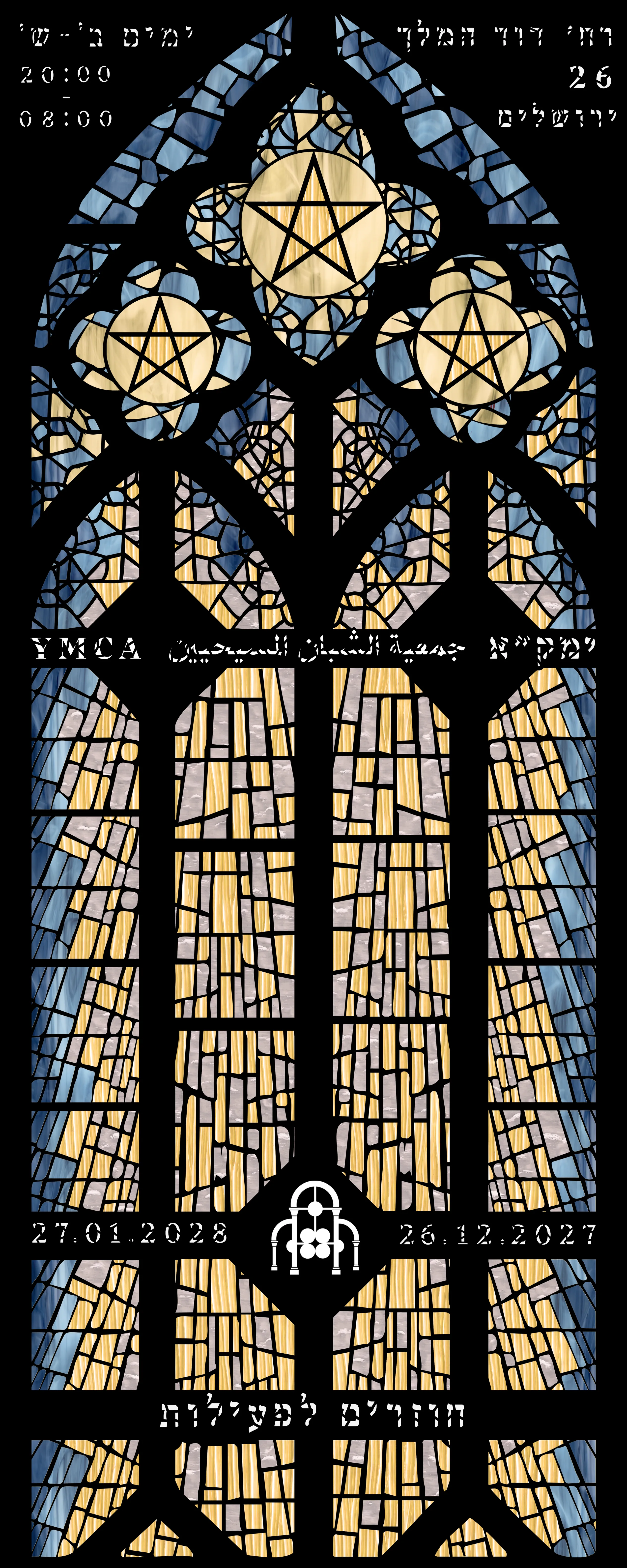
Reopening Poster
The reopening poster is structured around the stained-glass window as a symbol of the building's return.
The composition is symmetrical, monumental and relatively open. The window occupies the centre of the poster, while the typography is integrated into the architectural divisions.
Light becomes the main visual metaphor. The illuminated glass contrasts with the surrounding darkness, suggesting renewed access, activity and presence.
Organ Music Poster
The organ concert poster uses the same visual vocabulary in a more compressed and rhythmic way.
Here, letters and stained-glass fragments accumulate into a dense vertical field. The composition references the repetition of organ pipes, musical rhythm and the visual complexity of the building's interior.
Compared with the reopening poster, this version is darker, more fragmented and less symmetrical. It translates the architectural system into a more atmospheric and musical register.

Extending the system through time
The motion piece translates the static visual language into a sequence of light, fragmentation and typographic appearance.
The animation begins in darkness. Architectural fragments and stained-glass shapes gradually emerge, followed by the trilingual lettering and final event information.
Movement remains restrained and structural. Rather than introducing a new visual language, the motion extends the same principles already present in the posters: gradual illumination, vertical rhythm, fragmented construction, controlled reveals and tension between darkness and light.


The motion sequence builds the identity through gradual illumination, fragmented forms and trilingual typography.
Closing statement
The final result is a flexible event identity rooted in the architecture of the Jerusalem YMCA.
By translating the building's structural and decorative qualities into a modular graphic language, the project creates a system that can move between identity, print and motion while maintaining a coherent visual character.