01
If Metamor was a person
Elegant.
Reserved.
Timeless.
Present.


Fictional Winery Identity
Wine as metamorphosis.
METAMOR is a fictional boutique winery identity rooted in Kfar Kanna, Galilee. The project began as an academic brief to create a winery from scratch and developed into a full brand system around transformation, ritual and inward experience.
The brand is built around the idea of wine as a threshold: between place and memory, body and spirit, matter and feeling. Kfar Kanna became the conceptual anchor, connecting the identity to the story of transformation without using literal religious imagery.
Rather than defining Metamor through conventional brand attributes, I explored its identity as if it were a living presence. By translating the brand into architecture, scent, objects, rituals and atmosphere, I established an emotional framework that later guided every visual decision — from the logo to the packaging.
Elegant.
Reserved.
Timeless.
Present.
Architectural silhouettes.
Ceremonial garments.
Quiet luxury.


Slow rituals.
Reading.
Writing.
Silence.
Observing.


From research to system
These references became the foundation of every design decision. Rather than copying visual aesthetics, they established a coherent emotional language that informed the logo, typography, packaging, materials and overall visual system.
Instead of searching for something that sounded luxurious or directly referenced wine, the objective was to find a word capable of expressing transformation, silence and permanence.
Among all explored directions, "Metamor" captured the project's essence most precisely. Derived from the idea of metamorphosis, the name suggests transformation without becoming literal. Its short structure, measured sound and timeless character aligned naturally with the visual identity that was simultaneously emerging. Rather than describing wine, it describes an experience.
Rather than searching for a finished mark immediately, the process explored several interpretations of the project's central ideas. Vessel-like silhouettes, architectural thresholds and organic divisions gradually converged into a single visual language.
The first direction explored the vessel as both a physical object and a symbolic container. These studies focused on symmetry, inner space and the interplay between two forms becoming one.


The second direction moved toward architectural forms. Arches, steps and vertical openings became metaphors for passage, permanence and gradual transformation.


The final direction brought the organic and architectural ideas together. The mark became more pared-back, allowing the silhouette and negative space to suggest transformation without illustrating it directly.


Alongside the symbol, different typefaces, proportions and lockup structures were tested to determine how the name could coexist with the mark without competing with it.


The final mark preserves the ambiguity discovered throughout the process. It can be read as a vessel, an architectural threshold or two organic forms divided by a narrow passage. Its meaning remains open, while its proportions give the wider identity a stable and recognisable centre.

From the beginning, the visual language was intended to feel both structural and alive. Rather than relying on familiar wine imagery, the process explored stone architecture, branching systems and biological structures in search of a form that could feel ancient, organic and unfamiliar at the same time.
The first studies compared the permanence of old architecture with the movement of living systems. Stone surfaces, cracks, branches and vascular networks shared a similar visual logic: density, division, erosion and continuous growth.


The structure of the placenta became an unexpected point of departure. Its dense vascular network contained the drama, complexity and organic movement the identity required. The image was not used literally, but as raw material for visual abstraction.

The pattern became more effective as its original source became less recognisable. Through repetition, cropping and changes in scale, it could be read simultaneously as branching tissue, stone veins, cracks or an unfamiliar landscape.

The final pattern preserves the energy of the original structure while functioning as an abstract surface. It introduces living irregularity into an otherwise controlled identity, creating tension between organic growth and architectural restraint.

Black and white was a deliberate decision from the beginning. By removing color, proportion, texture and typography became the primary carriers of the identity.
The pattern completed the identity by introducing living irregularity into its architectural order.
The identity uses a controlled monochrome system, thin typography and organic linework inspired by maps, roots, stone and internal landscapes.
The identity is treated as a compact toolkit: a mark, a typographic voice, controlled color and organic drawing logic that can move between label, print and digital contexts.
Before refining typography or information hierarchy, the process began with the physical silhouette of the label itself. Different proportions and geometries were tested to create a form that felt monumental, spare and distinctive on the bottle.
The first stage focused on the label as a physical shape. Geometric silhouettes were compared in search of a form that could reference architecture without becoming ornamental or theatrical.

Once the basic geometry was established, several vertical and compact proportions were tested. The goal was to find a scale that could hold detailed information while preserving a sense of silence and negative space.


The label required a clear hierarchy between the wine name, grape variety, Hebrew and English typography, technical information and origin. Each version tested how information could remain readable without disturbing the overall restraint of the identity.


The final label system separates atmosphere from information. The front remains sparse and ceremonial, while the back carries the technical and regulatory content with the same typographic discipline.

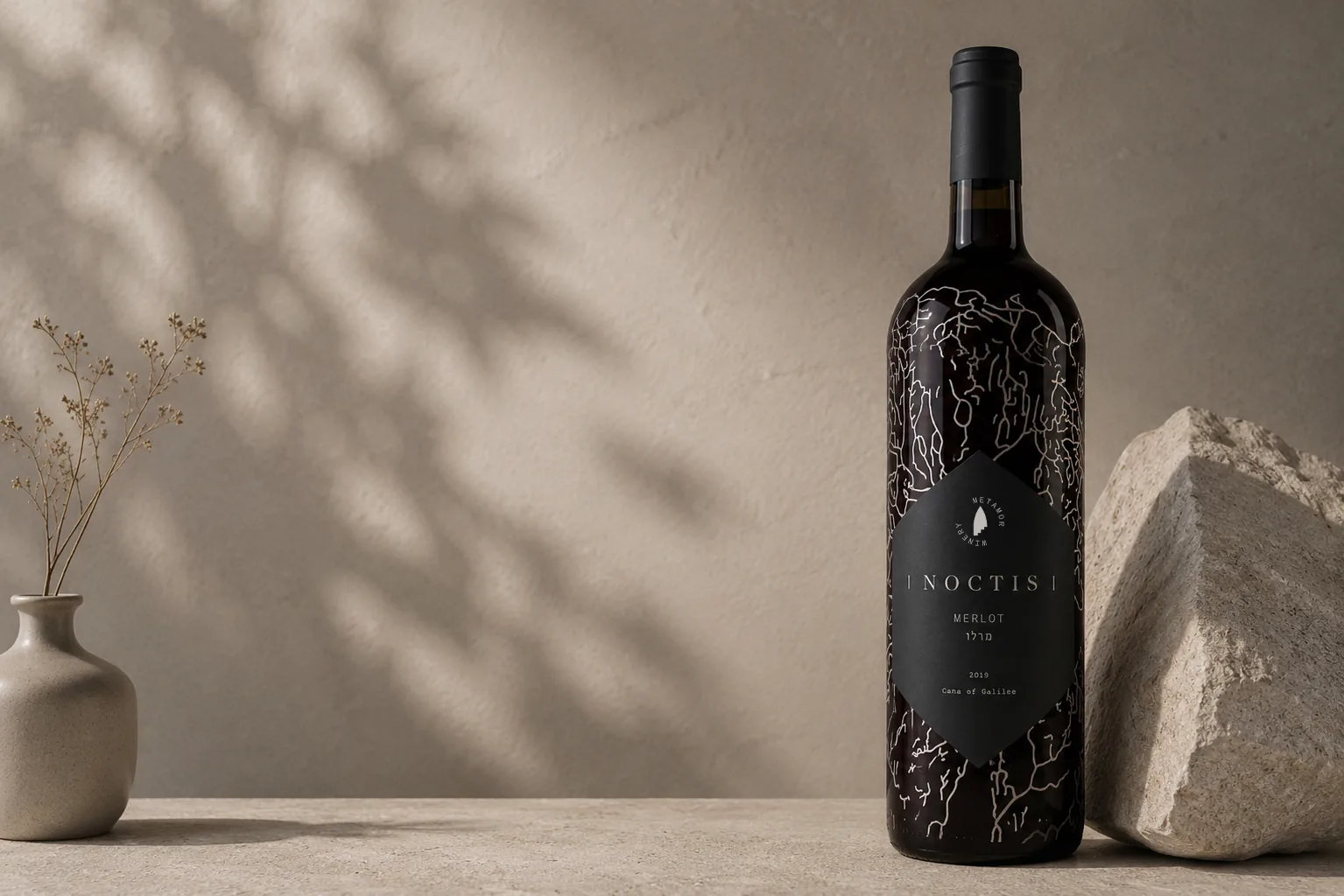
The final label combines an architectural silhouette with a considered typographic system. Its pointed geometry gives the bottle a recognisable profile, while the internal composition remains calm, balanced and functional.


A label system for four wines: Cabernet Sauvignon, Sauvignon Blanc, Rosé and Merlot.


The four bottles read together as a family, each carrying the same visual system while adapting to the tone and color of the wine.


The packaging extends the same visual language through monochrome surfaces, subtle textures and minimal typographic details.


The poster system translates the brand’s inner landscape into large-scale printed matter.


The website turns the winery into a digital experience, combining brand story, wine discovery, visit booking and bottle ordering.
Final brand presentation including bottles, packaging, posters and website.


The final identity translates a conceptual foundation — transformation without literal symbolism — into one coherent system spanning mark, label, bottle, packaging, print and digital touchpoints.
Rather than illustrating wine directly, the brand draws its character from architecture, material and a considered sense of personality, carried consistently across every surface.


