Packaging Redesign
JAM JARS
A new label system for a heritage preserve brand.
Reworking a heritage jam label for the shelf
Yad Mordechai is an Israeli food brand whose identity dates back to 1936. Its preserve packaging had accumulated many familiar signals of tradition: photographic fruit, wood textures, promotional badges, certification marks and several competing typographic styles.
The redesign does not reject that history. Instead, it separates the brand's lasting assets from the visual conventions that had made the packaging feel crowded and dated.
The new system removes photographic fruit imagery and rebuilds the label around Hebrew typography, a consistent information hierarchy and a shared structural framework. The result is calmer and more contemporary, while remaining recognisable as a local, established and accessible food product.
- Year
- 2025
- Type
- Packaging, Label System, Print
- Role
- Graphic Design, Packaging Design, Typography
- Tools
- Illustrator, Photoshop
A familiar brand buried under visual noise
The original packaging communicated abundance and tradition through literal imagery: fruit photographs, simulated wood grain, brightly colored panels and multiple promotional symbols.
Individually, each element was understandable. Together, however, they competed for attention. The flavor name, brand crest, product claims and certification marks occupied similar visual levels, weakening the hierarchy and making the package difficult to read quickly on shelf.
The packaging appeared familiar, but its idea of heritage relied heavily on decorative nostalgia. The redesign therefore began with a distinction between what was genuinely valuable to the brand and what had become visual excess.


Preserving recognition without preserving clutter
Several elements of the original identity were retained because they carried real brand recognition.
The green Yad Mordechai crest and the founding year remain at the top of the composition. Hebrew continues to lead the package, maintaining its local character. The flavor name remains large and central, while the overall composition preserves the direct, frontal presence of the original jar.
What changes is the way these elements are organized.
Rather than reproducing heritage through wood textures and fruit photography, the redesign expresses continuity through the crest, the date, the Hebrew-first identity, the central hierarchy and the straightforward tone of the product.
The aim was not to make the preserves appear luxurious or imported. It was to make an established everyday brand feel clearer, more deliberate and more confident.


From illustration to typographic identity
The redesign is based on a simple decision: the flavor name becomes the primary image.
Removing fruit photography creates space for typography to perform both an informational and expressive role. The Hebrew lettering gives each jar its personality, while the surrounding structure keeps the range consistent.
This shift changes the package from a collection of promotional graphics into a controlled visual system.
Recognition
Keep the brand crest, founding date and Hebrew-first identity visible.
Reduction
Remove decorative elements that do not improve navigation or understanding.
Hierarchy
Make the brand, product type, flavor and weight readable in a clear sequence.
Differentiation
Use color to distinguish flavors without changing the underlying structure.
Label Development
Version 01
Structural reduction
The first direction removed the original photographic fruit imagery and rebuilt the packaging as a monochrome typographic system.
A fixed central panel carried the brand crest, product category, flavor name, weight and key claims. Ingredients and nutritional information were organized on one side, while certification marks, production details and the barcode were grouped on the other.
This version established the fundamental architecture of the label. It clarified the hierarchy and proved that the packaging could remain recognisable without literal fruit imagery.
Its limitation was differentiation. In monochrome, the three flavors belonged to the same family, but they were not distinct enough to identify immediately from a distance.


The first direction established the label architecture through a fully typographic, monochrome system.
Version 02
Introducing flavor color
The second direction retained the same structural framework while introducing color as a functional identifier.
The central white panel remained constant, preserving continuity across the range. Flavor-specific color was applied to the large typography and technical details, allowing products to become distinguishable without adding illustration or decorative imagery.
This stage demonstrated that differentiation did not require a separate graphic language for each product. A controlled color shift was enough to create individuality while maintaining the appearance of one coherent family.
Only two surviving studies from this direction are shown.


Two surviving studies from the second direction, where color was introduced without changing the label architecture.
One system: structure, type and color
Label architecture
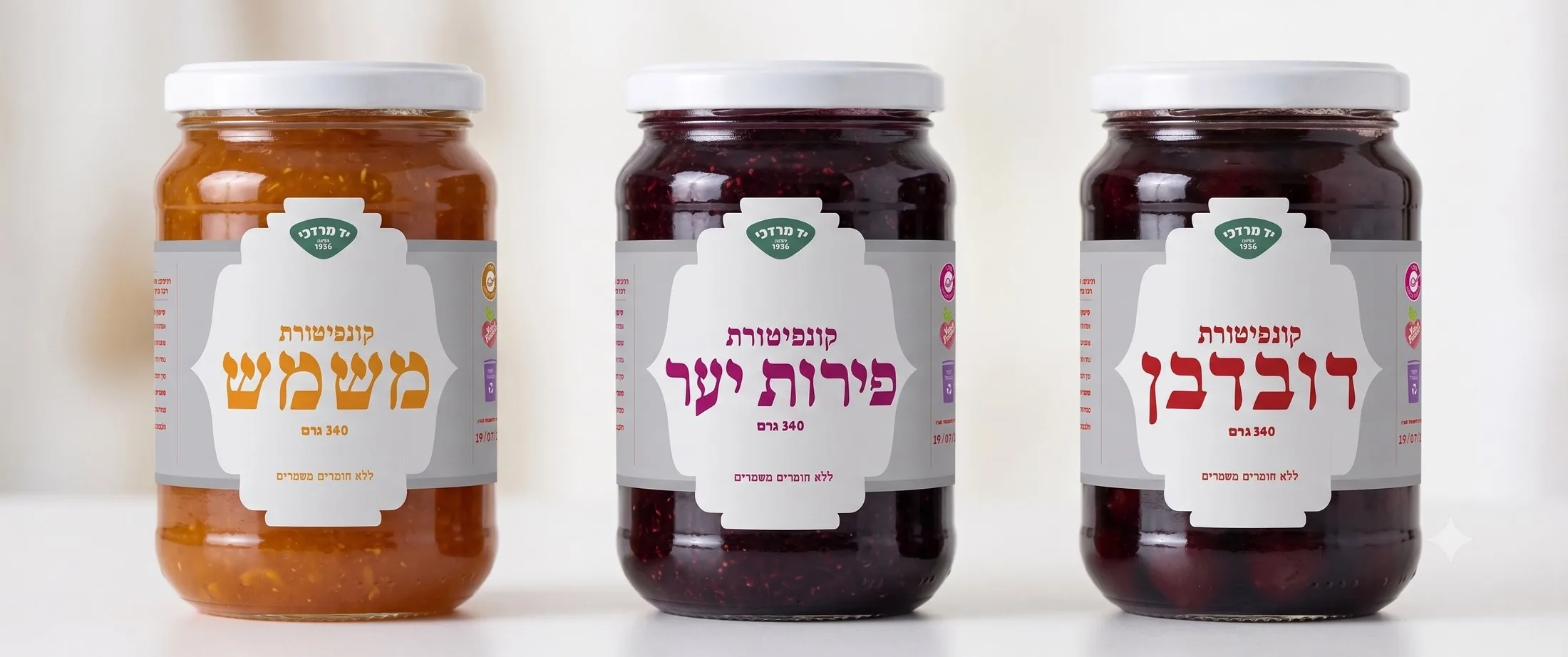
The label is a continuous wrap divided into three zones. The central panel carries what is seen first on shelf — the Yad Mordechai crest, product category, flavor name and weight — inside a symmetrical die-cut silhouette. One side holds ingredients and nutrition; the other groups certifications, production details and the barcode.
This arrangement stays fixed across all three flavors; only the product name, color and technical details change.

The flavor name becomes the image
Typography replaces the fruit photography: the Hebrew flavor name is set at large scale in the center of each label, while smaller functional text sits in narrow columns around it. The label reads at a glance from shelf distance and stays precise up close.


Color as navigation, not decoration
Each product uses one primary color derived from the fruit, so the flavors separate without returning to photographic imagery. The green crest stays constant as the brand anchor.
Apricot
A warm orange associated with the fruit's flesh and the light color of the preserve.
#E09020
Forest Fruit
A deep purple that reflects the darker berry mixture.
#B01068
Cherry
A saturated red associated with the fruit and the preserve itself.
#B82020
Brand crest (constant)
The green crest remains unchanged across the range, acting as a stable brand anchor.
#488070
Three flavors, one framework
The interactive label view allows the three products to be compared within the same structural system.
Selecting a flavor brings its label into full color while the others recede into grayscale. This makes both the shared architecture and the individual color coding visible without separating the products into unrelated presentations.
The interaction stays understated. Its purpose is comparison rather than spectacle.
Select a flavor
Refining hierarchy, proportion and distinction
The final system combines the clarity of the first direction with the flavor differentiation introduced in the second.
The proportions of the central panel were refined, typographic spacing was adjusted and the relationship between display text and technical information became more balanced.
The resulting labels are more understated than the original packaging but not anonymous. They preserve the brand's recognisable crest, founding year, local identity and directness, while replacing visual clutter with a controlled typographic language.
The redesign does not attempt to turn the product into an exclusive delicacy. It gives an established mass-market brand a more coherent and contemporary shelf presence.
The Jar Family
Applied to the jars, the system creates a clear family relationship.
The shared white structure, green crest and typographic hierarchy connect the products. Orange, purple and red allow each flavor to remain identifiable at a glance.


Closing statement
The final redesign reframes heritage as continuity rather than decoration.
By preserving the brand's recognizable crest, founding date and Hebrew-first identity, while removing fruit photography, wood texture and competing promotional elements, the system gives Yad Mordechai's preserves a clearer contemporary presence.
One label architecture, three flavor colors and a typographic center allow the range to remain familiar, distinct and coherent on shelf.